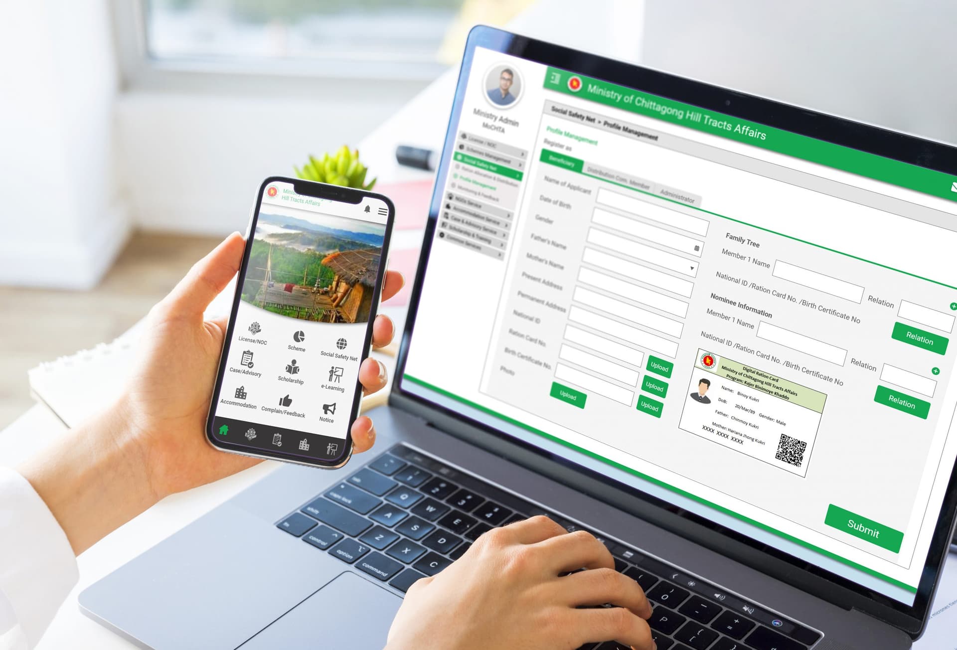
Citizen Portal for Ministry of Chittagong Hill Tracts Affairs
Designed a comprehensive Integrated Digital Service Delivery Platform to modernize government services through web and mobile applications, centralizing all services within a unified digital ecosystem.
Understanding the User
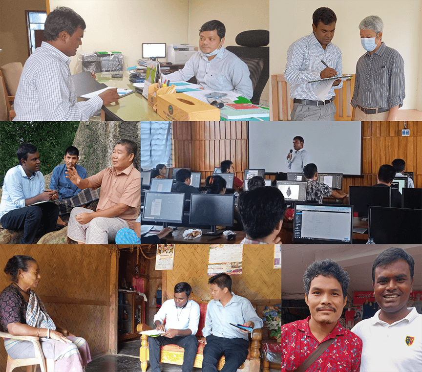
As a UX Researcher and Designer, my first step was to deeply understand the people I was designing for through comprehensive research.
Research Methodology
Through 50-60 Qualitative and Quantitative Interviews, my user research aimed to uncover behaviors, needs, pain-points, and motivations. This foundational research challenged initial assumptions, revealing unexpected user challenges and guiding the project's direction.
Defining the Problem & Users
Based on the research, I clarified the core challenges and defined the key user groups and their specific pain points.
Project Overview
The Ministry of Chittagong Hill Tracts Affairs in Bangladesh was struggling with inefficient paper-based processes, scheduling delays, and approval backlogs. We designed a comprehensive Integrated Digital Service Delivery Platform that modernizes government services through web and mobile applications, centralizing all service provider organizations and recipients within a unified digital ecosystem.
Problem Statement
The core problem was the lack of a centralized, user-friendly digital system for citizens to access and manage government services. This resulted in significant administrative inefficiencies, long processing times, and a frustrating experience for the public, ultimately creating a barrier to accessing essential welfare and development schemes.
User Personas
Service Recipient
"A citizen who needs easy, transparent access to government schemes and services without bureaucratic hurdles."
Service Provider Admin
"An administrator from a service-providing organization who needs to manage and deliver services efficiently through the platform."
Service Specific Operator
"An operator responsible for a specific service, needing tools to process applications and manage workflows effectively."
Ministry Admin
"A high-level ministry official requiring a dashboard for oversight, performance tracking, and data-driven decision-making."
Key Pain Points
Administrative Hurdles
Administrative delays, ledger conflicts, and dependence on authorized letters pose communication obstacles, significantly hampering overall efficiency.
Complex Welfare Processes
Users encounter bureaucratic hurdles, hierarchy issues, and complications with paper-based schemes, affecting their access to welfare benefits.
Skills Development Gap
Limited training opportunities hinder public skill development, limiting personal and community growth.
Social Safety Struggles
Difficulties in understanding ration schedules, distant distribution points, and decreasing ration quantities contribute to challenges in ensuring an adequate food supply.
User Access Matrix
To ensure security and role clarity, a detailed access matrix was designed. This defines what each user type can see and do within the platform.
| Feature | Citizen | Service Provider | Ministry Admin |
|---|---|---|---|
| View Services | |||
| Submit Applications | |||
| Track Application Status | |||
| Manage Profile | |||
| Process Applications | |||
| Communicate with Applicants | |||
| Manage Service Listings | |||
| View Analytics | |||
| Manage Provider Accounts | |||
| Configure System Settings |
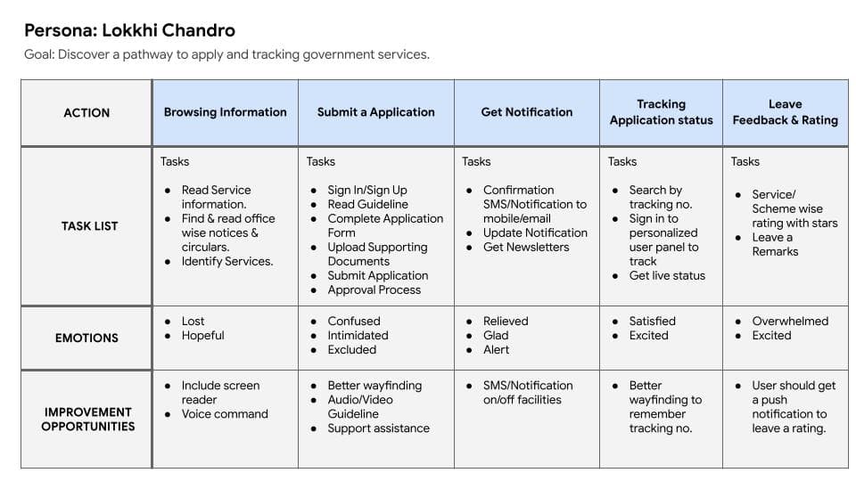
User Journey Map
Mapping the user journey was critical to visualize the user's experience and identify key touchpoints for improvement. The journey map below illustrates the path of a service recipient, from awareness to application submission and tracking.
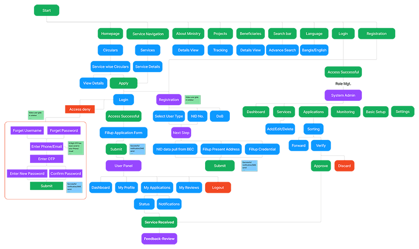
Information Architecture
A well-defined information architecture was crucial for creating an intuitive and scalable platform. It organized the content and services logically, ensuring users could easily navigate the system and find what they need.
Brainstorming Solutions
Generating a wide range of creative ideas and design approaches to address the identified user needs.
Wireframing Approach
I invested time in sketching multiple versions of both mobile app and web homepage designs on paper, ensuring that elements transitioning to digital wireframes were meticulously crafted to address user pain points effectively. This low-fidelity approach allowed for rapid iteration and exploration of various layouts and user flows before committing to digital designs.
Key Design Decisions from Ideation
- • A prominent services menu should be at the top for swift access to core functions.
- • A persistent left-side filtering system would be needed for easy navigation through complex service lists.
- • A sticky action bar on the right side of the screen would improve mouse-friendly interaction on larger screens.
Building the Solution
Creating interactive, high-fidelity mockups to simulate the final product and prepare for user testing.
Prototype Development
The prototypes were developed for both mobile and web platforms, integrating with the primary user journey and encompassing creation and ordering processes within the citizen portal. These were not just static images but interactive models that allowed for realistic user flow testing.
Accessibility Considerations
Screen Reader Compatibility
Ensure the portal is compatible with screen readers to provide access for users with visual impairments.
High Contrast Design
Option for readable fonts and ensure high contrast between text and background colors to improve legibility, catering to users with visual challenges.
Responsive Design
Adopt a responsive design approach to ensure optimal user experience on various devices, providing accessibility on both web browsers and mobile devices.
Validating the Design
Gathering user feedback on the prototypes to identify usability issues and areas for refinement.
Usability Study Results
Round 1
- User desires a focus on tracking features
- User wants interactive support assistance
Round 2
- User wants to ensure secure payment confirmation
- User aims to minimize text and explore alternatives to icons or images
- User wants an easier registration/login process for improved accessibility
- User wants to navigate through services on both the web & apps
Impact & Results
Project Impact
The system brought about notable improvements, enhancing efficiency and user satisfaction through features like increased accessibility, streamlined workflows, and real-time data availability. Its scalability, flexibility, and commitment to best practices contribute to positive organizational impacts.
Key Learnings
Key takeaways include prioritizing user-centric design, emphasizing accessibility, and embracing continuous improvement based on user feedback. Scalability and adherence to best practices emerged as crucial factors.
Key Metrics & Impact
Next Steps
User Feedback Analysis
Conduct thorough analysis of gathered user feedback to identify specific areas for improvement and refinement.
Iterative Design Updates
Implement design updates based on insights gained from user feedback analysis, prioritizing usability improvements.
Accessibility Testing
Perform comprehensive accessibility testing to ensure compliance with standards and inclusive user experience.